A lot of steps for a simple goad - Komoot's route planer UX
A long time ago I wanted to make a post about the bad UX of the route planer inside the Komoot app. I took a few screenshots of it. Now that Komoot is almost dead it’s the last chance to write about it.
When I try to plan a route, I’d expect it to be these steps:
- Click “Plan new route” button
- Click “Choose starting point”
- Click the search bar (or any other way to select the starting point)
- Enter address, select search result: the selected address is added as the starting point
- Click “Choose destination”
- Click the search bar (or any other way to select the destination)
- Enter address, select search result: the selected address is added as the destination
What Komoot is doing:
- Click “Plan new”
- Click “Plan new route” button (again?)
- Click “Choose starting point”
- Click the search bar (or any other way to select the starting point)
- Enter address, select search result: the selected address is shown on the map
- Click “Start here”
- Click “Plan new route” button (again again??)
- Click “Choose destination”
- Click the search bar (or any other way to select the destination)
- Enter address, select search result: the selected address is shown on the map
- Click “Set as Destination”
This is 4 steps more or an increase of steps about 57%. One additional step for starting the route planer (2 instead of 1 step, 100% increase), one additional step for choosing the starting point (5 instead of 3 steps, 66% increase) and one additional step to choose the destination (4 instead of 3 steps, 33% increase).
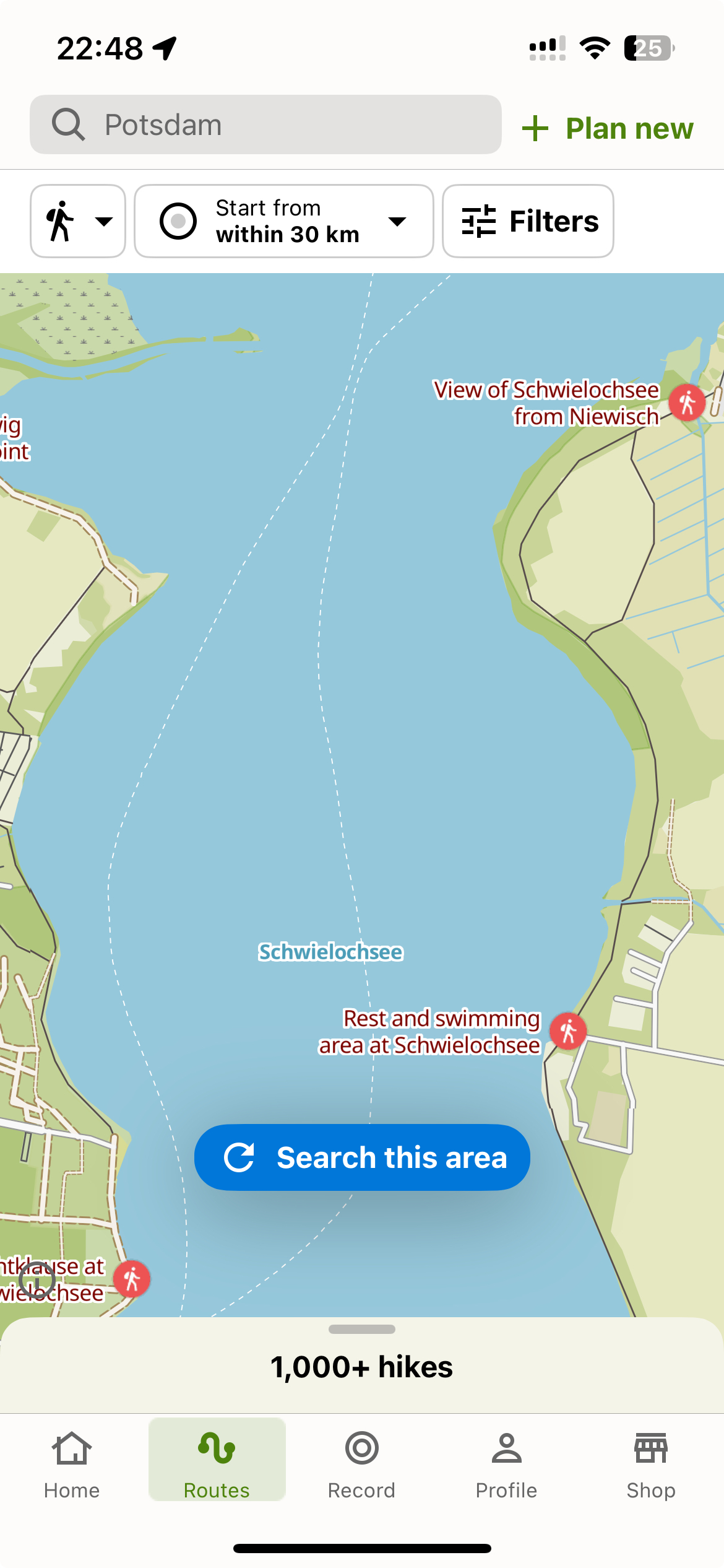
Starting the Route Planer
I’d say almost everyone is using the search bar to search for the starting point or destination. Seldom it’s faster to look for your starting point or destination directly on the map. I’d get rid of the intermediate step of showing the map after clicking “Plan new” and would immediately show the third screen (route overview).
Choosing Start And Destination
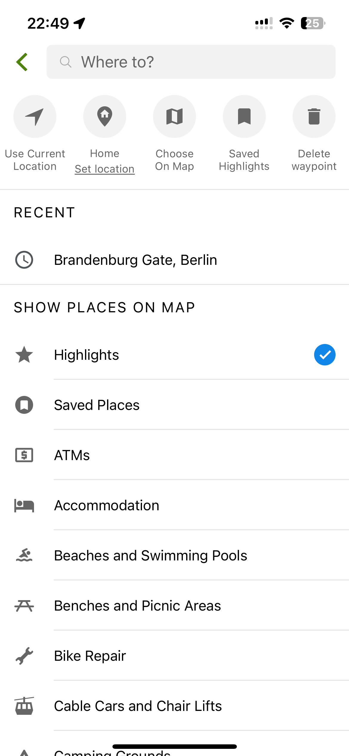
Why’s are there input fields labeled as “Choose starting point” and “Choose destination”, if it doesn’t matter which one I click on? By clicking one of those fields I already decided if it’s the start of the route or the destination. No need to show the search result on the map and ask the user to add it as the route’s start or as destination. If I clicked on the wrong button, I’d instead simply have a toggle / switch button next to start / destination to reverse the direciton. This feature is hidden below the three dots.
Also showing “Where to?” as the placeholder text for the address search bar is misleading when I just clicked on “Choose starting point”. This should be changed dynamically based on the previous selection.


Komoot please fix. Komoot won’t fix.