Bad UI in real life
I once wrote about the bad list layout of YouTube’s search filter screen , now I experienced a real-life bad UI in a gym I went for the first time.
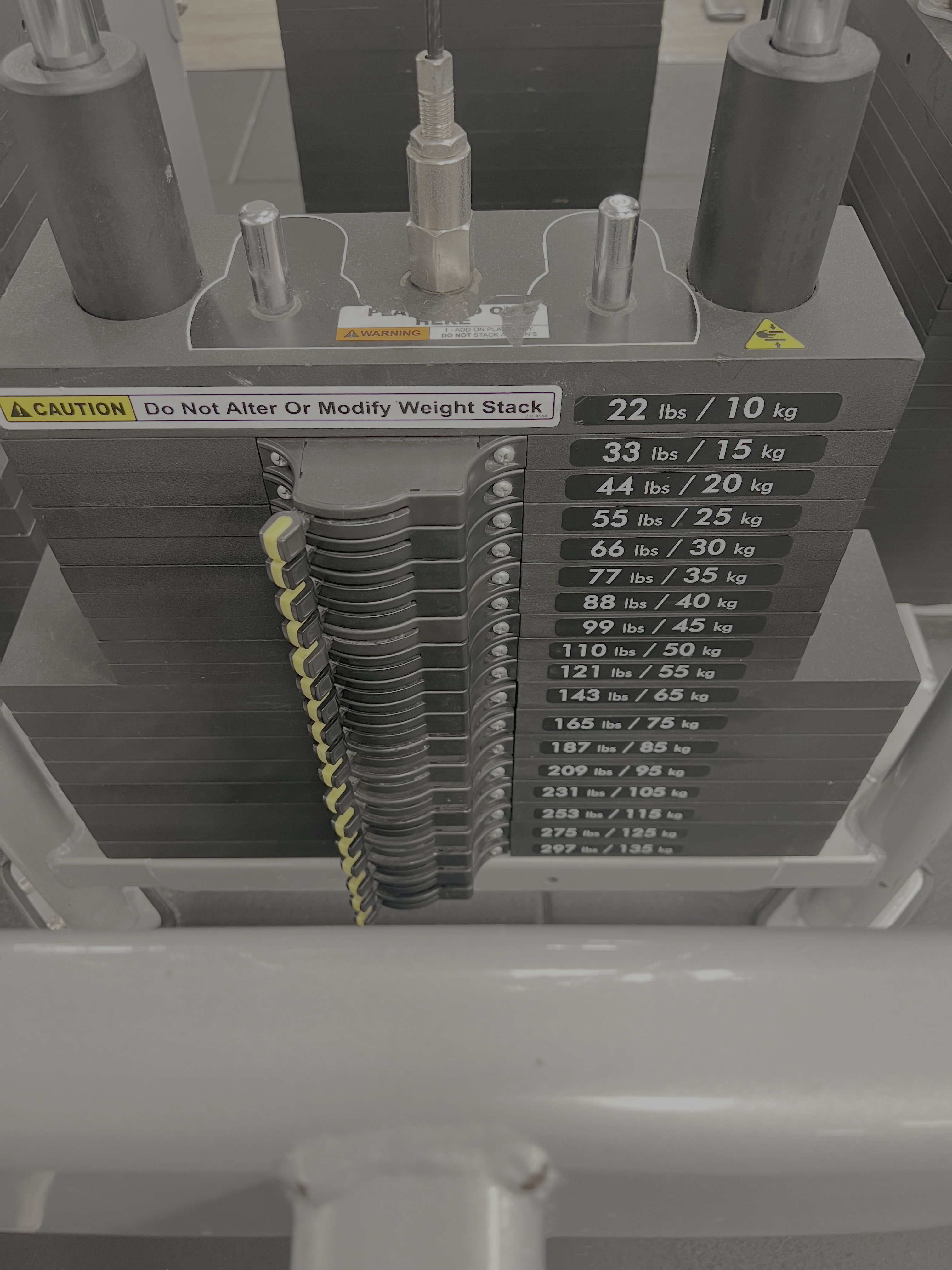
In the first moments I was unable to identify the correct yellow lever I need to turn to “enable” my desired weights. The distance between lever and weight label is so far apart that I sometimes either used my finger to not slip to a different row or counting the rows from top. The acute angle, looking from the top, distorts the view even more. I think the weight stack could have been improved by placing the labels on the left of the levers. When the levers are turned off, they are closer to the label.
comments powered by Disqus