First thought on Liquid Glass - iOS and macOS 26
Today, Apple introduced their delightful and elegant new software design for iOS 26 and macOS 26 on the WWDC25. My first impression is simple: it’s hard to read button labels when the background is almost transparent. But see yourself:
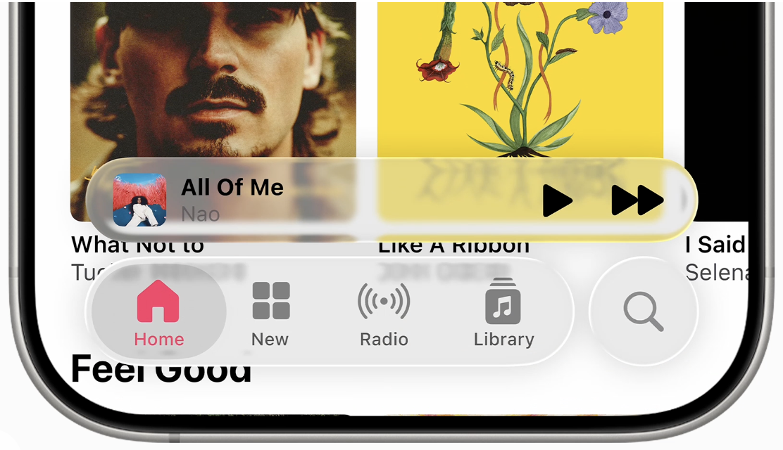
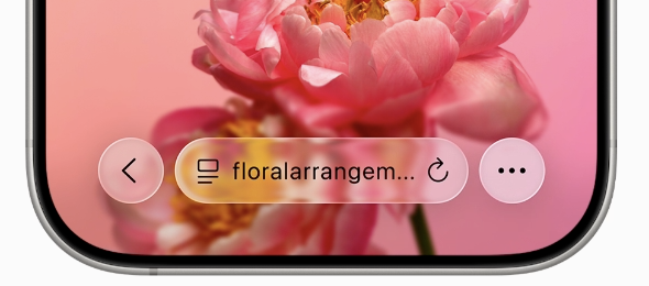
The glassy buttons have a glass-like border and blurred background, making text extremly hard to read and adding mirroring of the background just like on water. You can see this especially at the bottom border of the Music app’s image. The cover images are mirrored a second time.

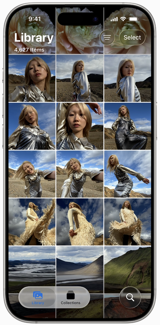
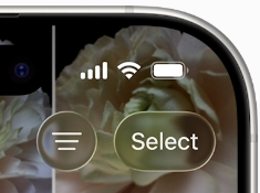
The top right filter and select button on the Photos Library page remind me of the old internet when everyone had a bad network connection and images were only 16 pixels and rendered blurred.
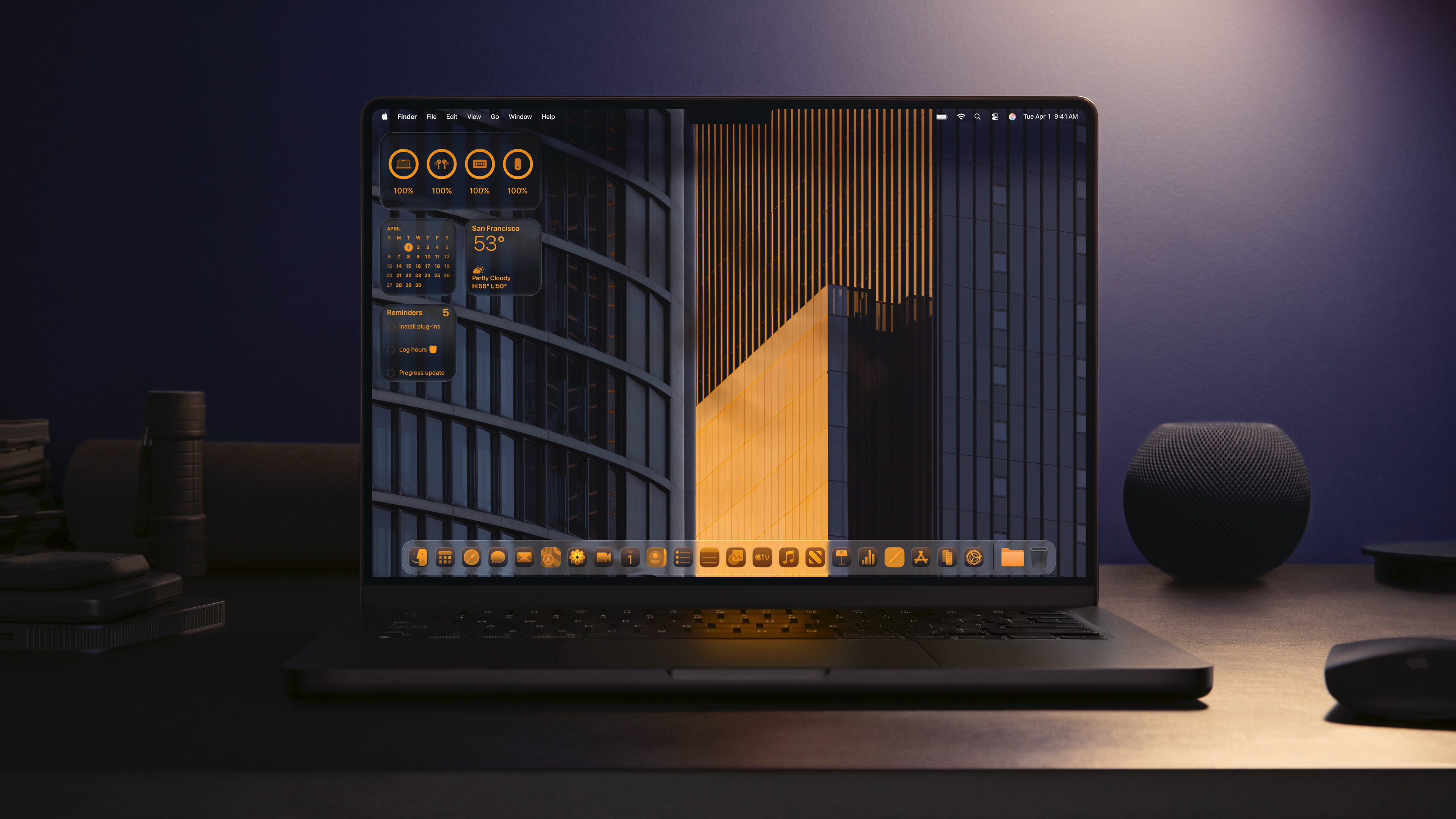
The new MacOS Tahoe 26
I simply do not like the new icon dark / light appearance. It so much reminded me of In Defense of Text Labels (which I wrote about here ), an article on why text labels are important and icons are not always enough for a user. With the new dark / light app icons, the Dock looks like a uniform mash or - how you’d call it in german - Einheitsbrei.