Google Maps New Back Button Design
I gave the new Google Maps redesign a try. It’s one of those let’s do something new just to do something new redesigns. I try to understand why they changed the back button to a misplaced x-icon.
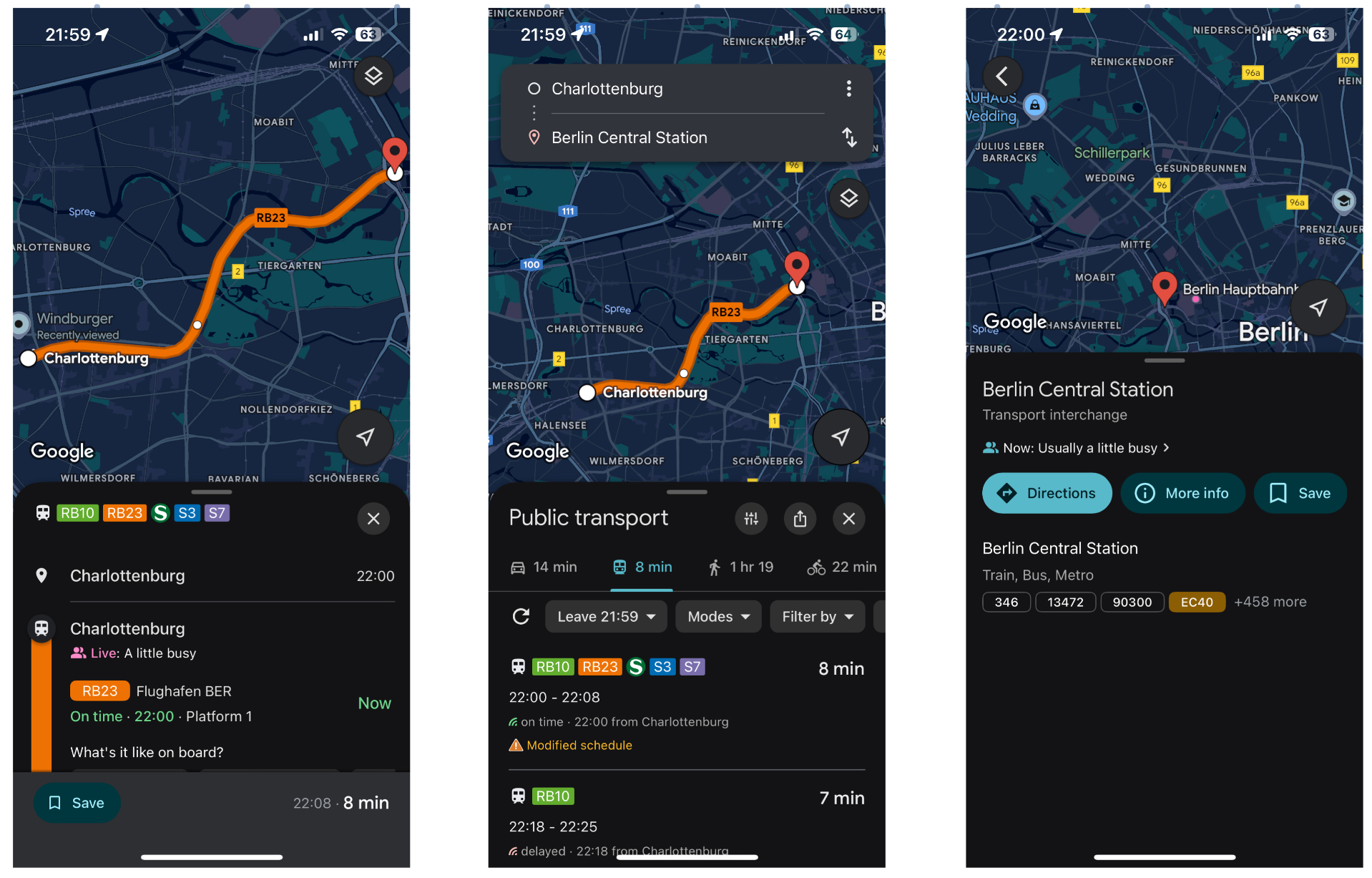
Have a look at the image. The left image is the one that is a so-called detail view of a (public traffic) route. Previously there was a back button at the top left. Now there is a close button on to far right at the top of the bottom sheet . For me, a close button indicates to get back to the top most layer - in this case poping the whole navigation stack that lead from the general map view to this detailed route view. I’d expect the same behavior when closing the bottom sheet. Instead, a single navigation pop is performed getting me back to where I was before: the route overview (image in the middle). Since the route overview (image in the middle) is only one step away from the top navigation stack page, a click on the close icon in this case get’s you (correctly incorrectly) back to the map view without any selection. When you select a POI on the map (right image) you actually can navigate back via a back button. Why don’t you now use a close button instead?
Personally, I’d prefer to always make the back button available at the top left. I’m open to discussion if I’d allow a close-button, i.e. poping the whole navigation stack, or if it’s too confusing and unnecessary since there are only three layers in total (home map view -> route overview -> route detail view) that could come up.
Notice: This was tested on iOS. I do not know if the app ui is different on Android devices.