How quickly UX patterns become habits - Steve Jobs' presentation of the first iPhone
I once again watched the presentation of the first iPhone
on YouTube. I watch it once in a while since it is iconic and I simply like the way Steve Jobs gave presentations back then.
This time I saw something I haven’t noticed before. After he introduced the iPhone, the iPhone is connected to the presentation and he shows the call app, how to watch videos, how to play and rate music, how to move through cover flow and how to scroll contacts. At one time he opens a detail page in the iPod app (i.e. music app), similar like my amazing drawing:
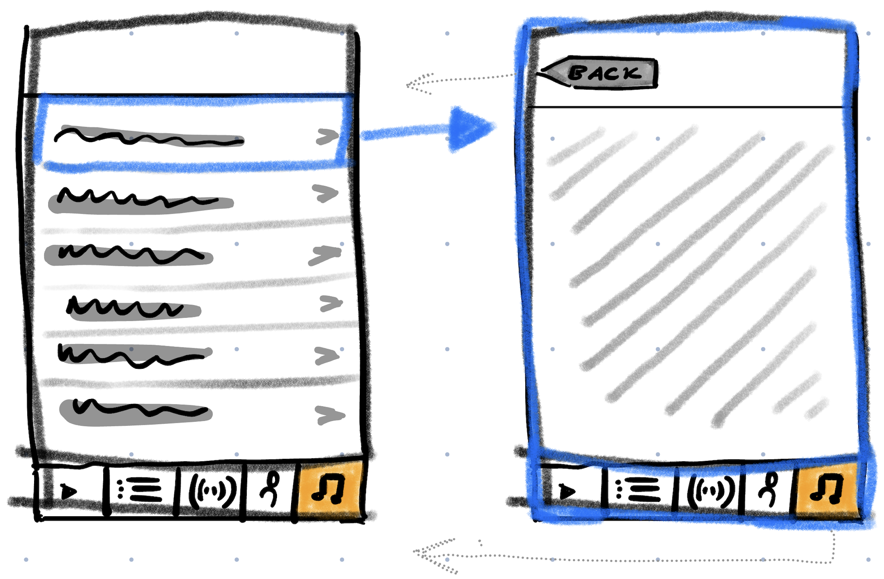 From the left list view you can access the right detail view by tapping on one of the list items. At all times the right-most tab is selected (that’s why it’s highlighted in orange).
Then you can go back - as we all know - by tapping on the back button in the top left corner (indicated by the dotted arrow). In most cases, you’re also able to do a swipe gesture from the left border of the screen to the right to trigger the back navigation. With the tab bottom bar
1 the iPod app provides a third navigation method. Tapping on the already selected tab to pop everything from the navigation stack besides the top most view of the tab. This is different behaviour compared to the back button and the swipe gesture for a navigation stack of size > 2. For a single detail view (navigation stack of 2), all three methods behave the same.
Coming back to the presentation, at one point Steve Jobs chooses to tap on the tab instead of using the back button2 which somehow is kind of not ideal.
From the left list view you can access the right detail view by tapping on one of the list items. At all times the right-most tab is selected (that’s why it’s highlighted in orange).
Then you can go back - as we all know - by tapping on the back button in the top left corner (indicated by the dotted arrow). In most cases, you’re also able to do a swipe gesture from the left border of the screen to the right to trigger the back navigation. With the tab bottom bar
1 the iPod app provides a third navigation method. Tapping on the already selected tab to pop everything from the navigation stack besides the top most view of the tab. This is different behaviour compared to the back button and the swipe gesture for a navigation stack of size > 2. For a single detail view (navigation stack of 2), all three methods behave the same.
Coming back to the presentation, at one point Steve Jobs chooses to tap on the tab instead of using the back button2 which somehow is kind of not ideal.
- It’s the first presentation of a good smartphone and the first presentation of iOS
- There is a back button with the label back to get back
And still, Steve Jobs chooses - probably subconsciously - to tap on the tab whose behaviour is for the audience unclear. At this point, Steve Jobs probably played around with the iPhone already for hours. However, it still fascinates me how fast this UX pattern became his habit and rewired his brain. At some point he must have discovered that the tab button works as a back button and that it’s easier to tap on the tab button instead of reaching to the back button in the top left corner. And at some point even before that some developer has decided to implement a navigation functionality if you press the tab button when not at the top most of the navigation stack.
In my opinion, the bottom tab bar is getting more unpopular at least with Apple apps. For example, the photos app is completely redesigned without bottom tab bar in iOS 18. I haven’t verified, if there are any such shift in app design. The podcast app, music app and the Spotify app still provide bottom tab bars. ↩︎
I’m not completely sure if iOS 1.0 had swipe gestures already implemented. ↩︎