Is it Slack or is it Apple Photos?
For the first time I accidentally opened slack instead of the iOS photos app on my iPhone because I mixed the two logos up. I wonder if this had any legal consequences in the past.
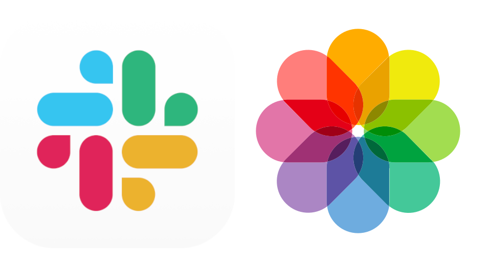
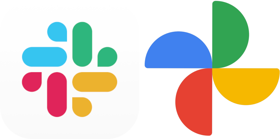
You could also rotate / flip the icons to match even more. They all come with the color combination blue to green to yellow to red. And look at the similarity between Slack and Google Photos icon. This time I rotated and flipped the Google Photos icon.
comments powered by Disqus