Spotify doing bad UX things
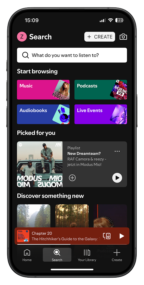
Spotify added a new button to their mobile app - AFAICT on all devices, not only A/B testing. The new button is part of the navigation bar:
Most of the times I open Spotify, I want to play a playlist or music from my saved songs. I automatically tap the bottom-right of the screen without even looking. This is a simple user habbit . Instead, I now open the “Create” Modal. I hate it. I would love to see the stats of people accidentially tapping on this just before they navigate to the “Your Library” tab compared the those who tap the “Create” Tab consciously.
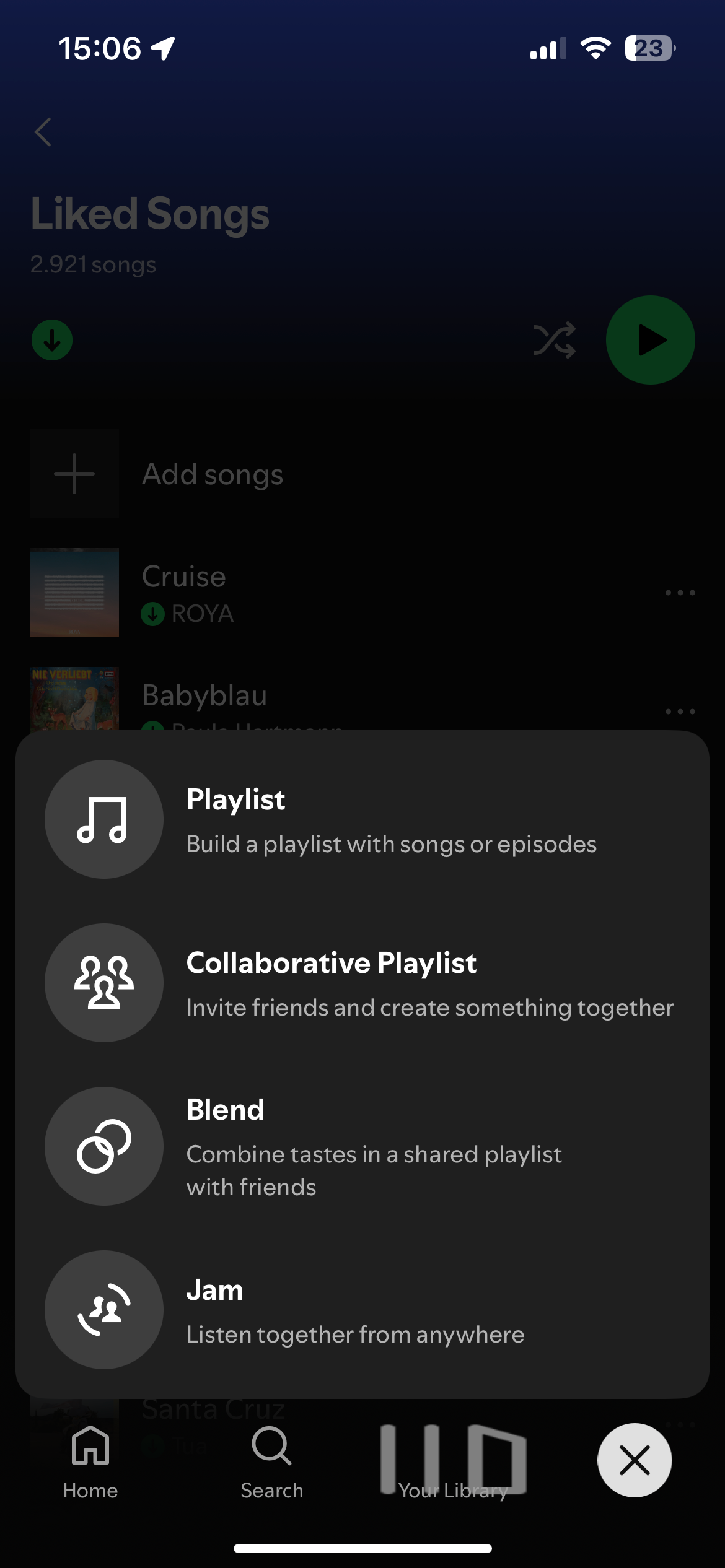
The action buttons in the “Create” Modal are not important. Spotify want’s to make its app more interactive, a social experience, and less a streaming music player. As a user, and I believe a lot of users think the same way, I do not need my music player to be a social network. All these actions could be placed somewhere without this much focus. Most of them already are. You can always create a new playlist by opening the context menu of a song.
The new button reminds me of the “+” button in the YouTube app. You can take a video and upload it to YouTube. There might be some people who use this. However, most of the users probably would never use this. Either you’re a YouTube user, i.e. you only watch videos, or you’re a (professional) content creator who does some kind of post-production.
I do not mind, if Spotify wants to add this new modal, however, I do mind that it results in a change of my user habits.
Instead of their implementation, I would add the button at the top - next to another (useless) secondary action, the camera button: