The Comdirect-App sign in disaster
Is this a button or is it part of the design?
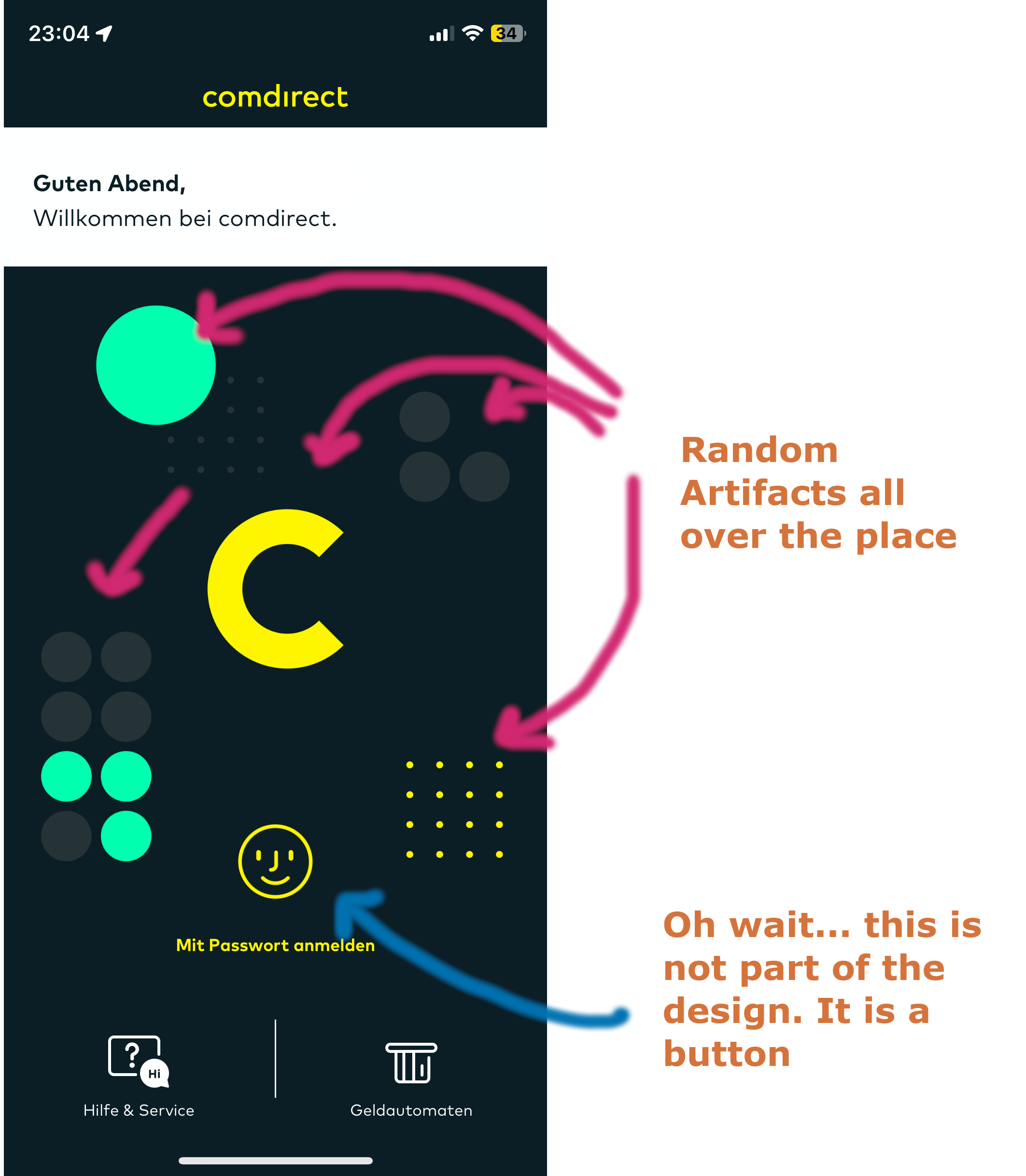
You start the comdirect app and you are flashed by an “amazing” design. You never know if the artifacts and colors are part of the design or remnants of a physics engine written for Android and iOS devices. On the first start it took me almost five (!) seconds to recognize the face id button between the lime and other (!) yellow “thing” next to it.
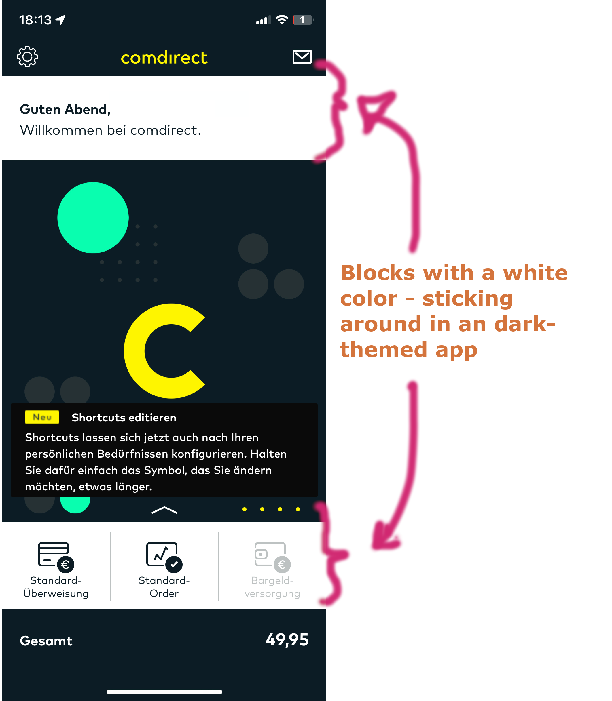
After the sign in
Why do they use this ugly blackish-white-block design? It especially makes it quite hard to understand the primary CTAs.
What would I do differently?
- Change the design. Use either a dark or light theme (and maybe implement a typical darkmode theme switcher).
- If you still want to keep these lime- and yellow-colored dots and artefacts: Put them in the header bar, use them as a splashscren or show them after a successful operation (e.g. order execution).
- Make “Unlock with Face-ID” (or Unlock with TouchID) an automatic functionality: start it as soon as the login screen is loaded for the first time.
comments powered by Disqus