This is the next Spotify post in my series of Spotify building bad UI and UX, following my previous post in which I wrote about the latest episode indicator, aka the Blue Dot .
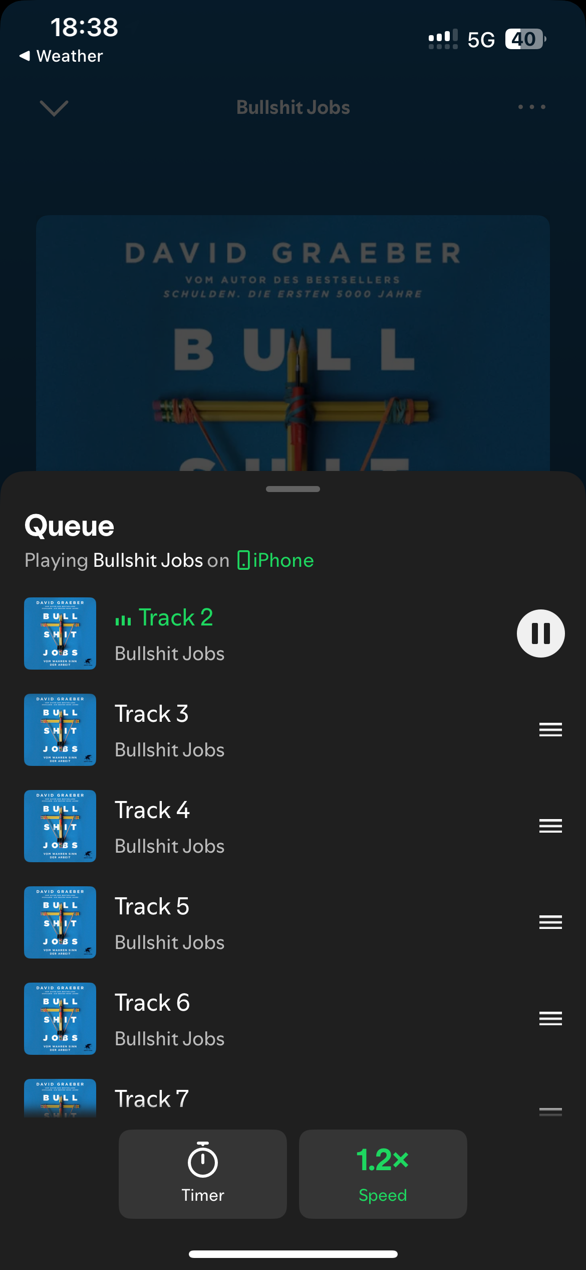
In the last weeks, Spotify increased the number of available audiobooks. With that, I decided to give one of them a try. Since I listen to a lot of podcasts I tried to increase the playback speed to 1.5x. While it was previously at the audio player screen - where it belongs - it’s now located behind the queue button at the bottom right. The queue view is to change the songs in queue, either reordering or removing songs completely from the queue.
What I like about this change
I first expected the button to be located behind the top right menu / actions button and I first thought the placement inside the queue view is rather wrong. By now I think the placement is not that wrong:
- It’s easier to access and logically more close to the playback interface
- The queue is still accessible, the buttons do not interfere with the queue view
What I don’t like about this change
The Playback speed and the sleep timer are both secondary actions for the normal music playback. When listening to a podcast or audiobook, these actions become primary actions. This makes it quite unintuitive for some users. At one point you only find these actions at the queue view, at some other point you find them next to the previous / play/pause / next buttons.
I also wished for a better communication, i.e. it’s not communicated at all that these actions can now (also) be found at the queue view. I’d expect a popup / information bubble indicating that these buttons moved the first time I open the audioplayer view after the update.
I consider the number of clicks as an important metric. With the change it now takes 4 instead of 2 taps / clicks to set a sleep timer and get back to the previous playback screen (when listening to music). If you compare it with the previous version this is an increase by 100%.
From a personal perspective, I also don’t like that the share button is still present next to the queue button. The share button is a secondary action and therefore should be located together with all the other secondary actions. From Spotify’s perspective, I can understand that sharing is an important feature to increase the overall interaction between users and the app.
What’s next
Overall, I can understand the change. I know that there’s no perfect solution and there’s not a simple one-to-fix-it-all solution to declare an action as either primary or secondary. Yet I still don’t like the amount of times the interface is changed. Every time every user needs to adapt to the things that the Spotify developer and designer team decided to change.