YouTube's Search Filter List layout on tablet devices
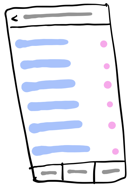
YouTube applies the same layout concept for both its smartphone app and its tablet app. However, some best practices for the layout just do not apply to bigger devices. I think everyone knows this stretched layout:
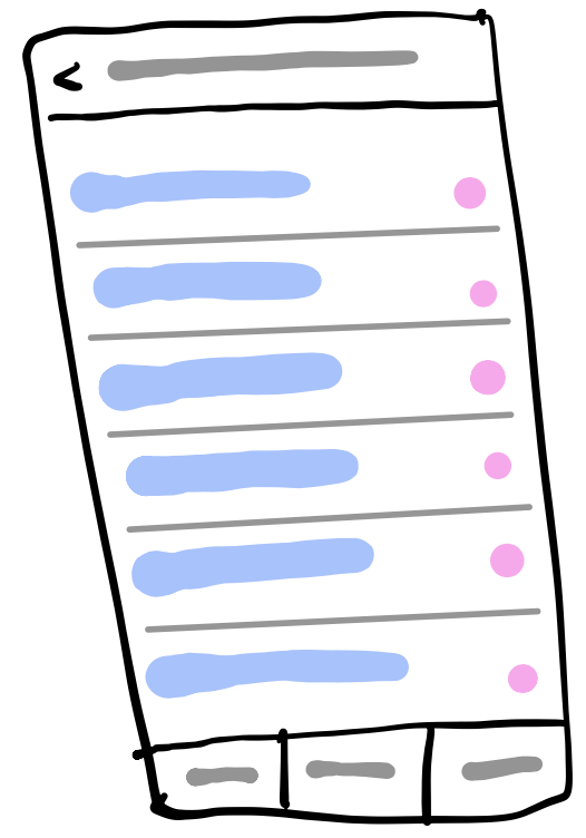
You could improve this layout by adding some dividers:
This looks great! But wait. Have you tried this on a large (horizontal) 10" screen?
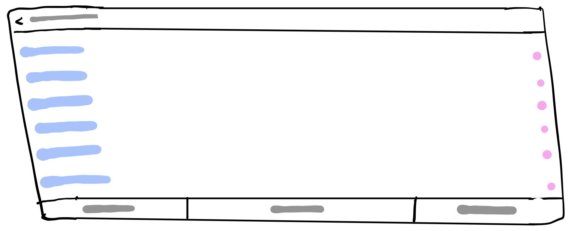
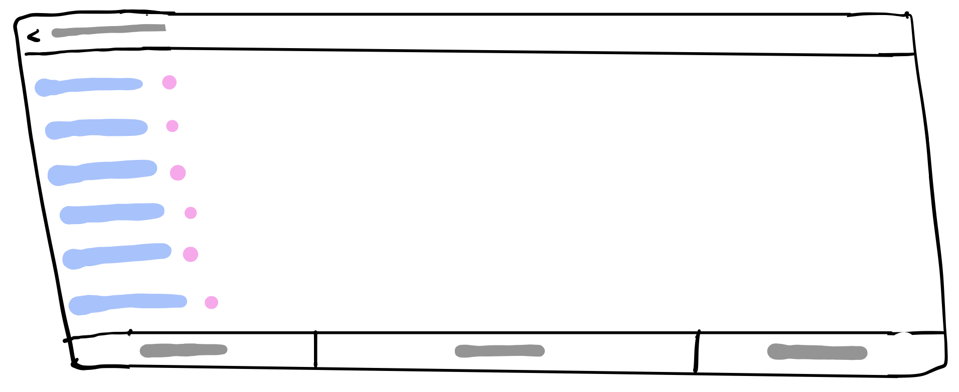
Now, it’s harder to select the correct value. Sometime I have to count the number of rows on both sides to know which row I should select. Maybe I need a ruler. And if you add the dividers..
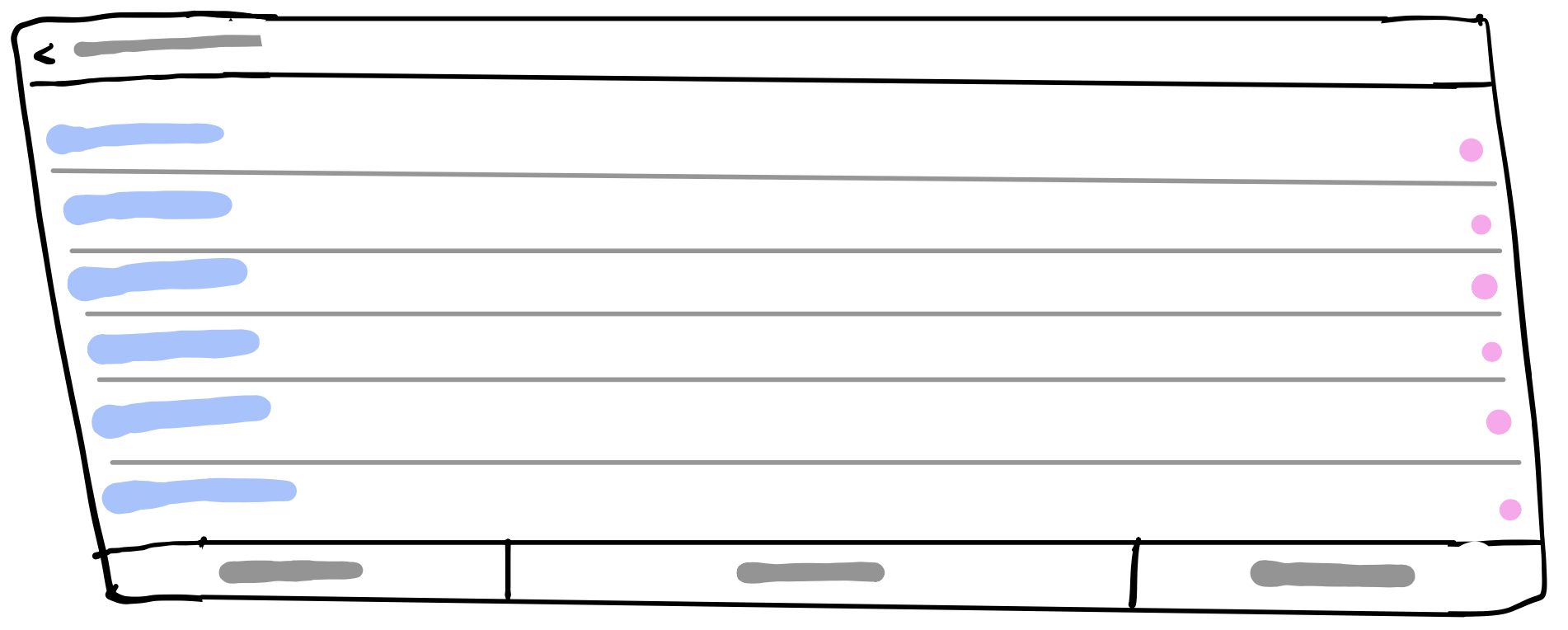 ..you’ll see that the dividers do not really help in this case anymore. While moving your eyes from the left (the label) to the right (the action/value) you can so easily mess up the rows.
When you look at the YouTube’s app search filter settings, you can see how bad this layout inside a real app. Can you only look at the values (right side of the image) and guess the correct row’s of the checkmarks?
..you’ll see that the dividers do not really help in this case anymore. While moving your eyes from the left (the label) to the right (the action/value) you can so easily mess up the rows.
When you look at the YouTube’s app search filter settings, you can see how bad this layout inside a real app. Can you only look at the values (right side of the image) and guess the correct row’s of the checkmarks?
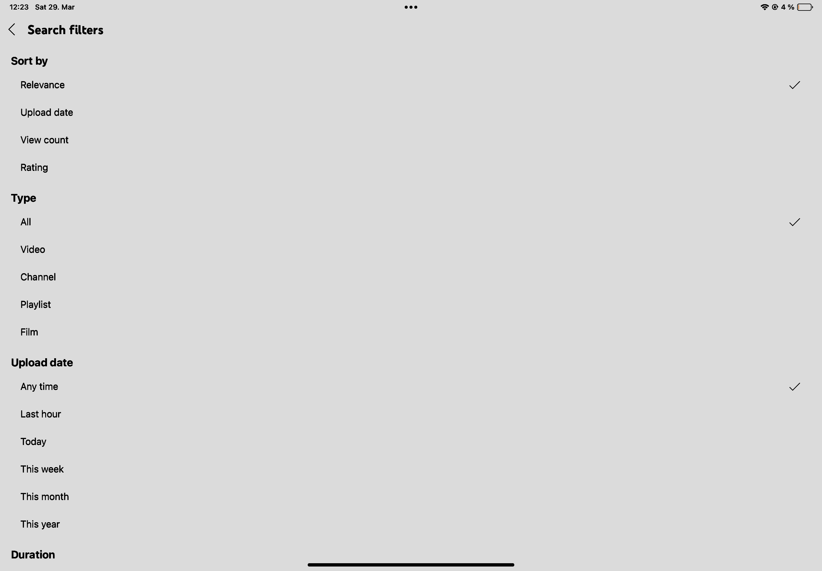
Probably not. It’s so hard to know what value is selected.
What would I do instead? Either place the value in front of or directly behind the label:
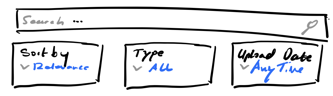
 or, as it is quite common in the last years in so many apps, place the filters as drop downs directly under the search bar.
I’m sorry for my horrible sketching skills.